Light Letters
Light Letters is an application which provides quick, efficient, paperless solutions to improve communication between schools, parents, and children.
Light Letters Languages is a translation app designed to help doctors and patients communicate in spite of language barriers.
Industry
Tech
Involved
ONQOR Design
ONQOR Production
The Challenge
We were presented with two separate challenges. Light Letters needed guidance on branding and illustration to target schools, whilst Light Letters Languages was seeking a media agency to help design and produce an animation for the brand, targeting patients with language barriers and communication difficulties.
The Key Deliverables
Development of brand identity
Animation
The Solution
We set our design team to work on the branding and illustration for Light Letters while the media team tackled the design and production of an animation for Light Letters Languages.
01
Branding
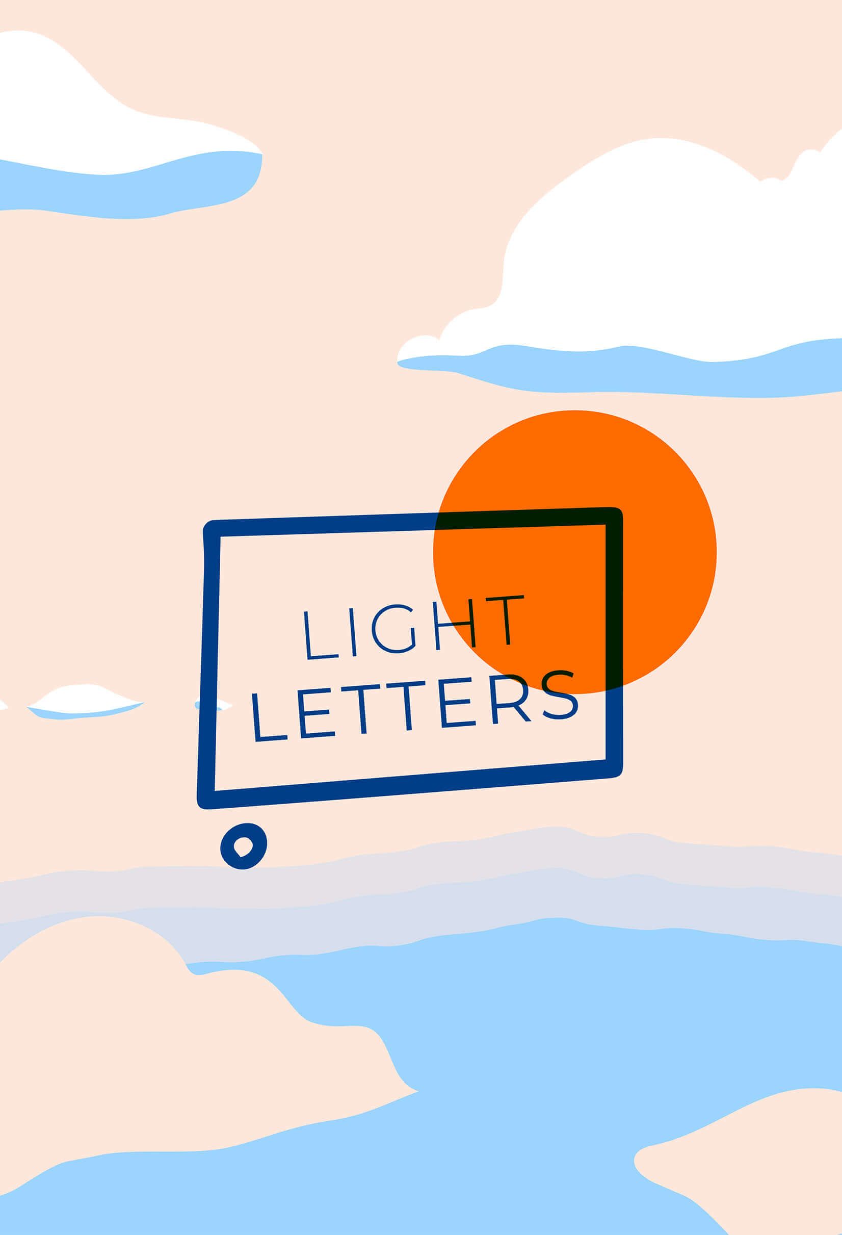
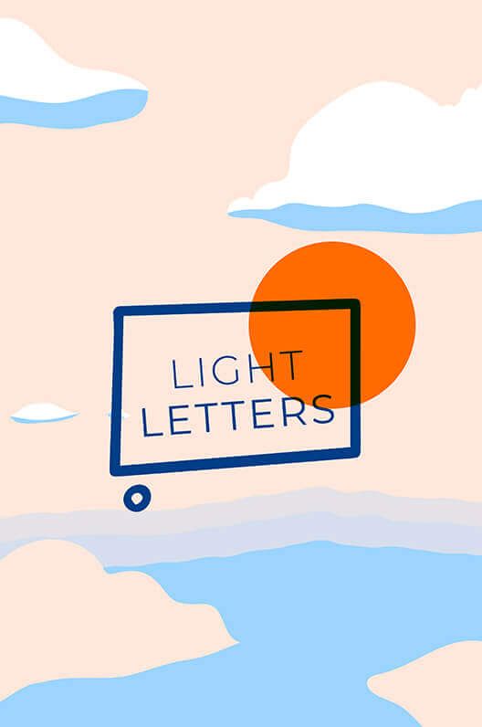
ONQOR Design constructed a distinctive brand identity for Light Letters to better define the brand guidelines ahead of targeting schools. They began this process by imagining an abstract version of a letter, as the main service offering was to digitalise the act of sending a physical letter. The aim was to create a strong contrast between the fonts to give the logo more depth and to symbolise the business offering (the exchange of ‘Light’ Letters). Our designers employed the Complementary Colour Palette Theory when selecting the brand colours to infuse the branding with a dynamic and young feel. The team had the idea to use different shapes to illustrate the communication between two individuals.
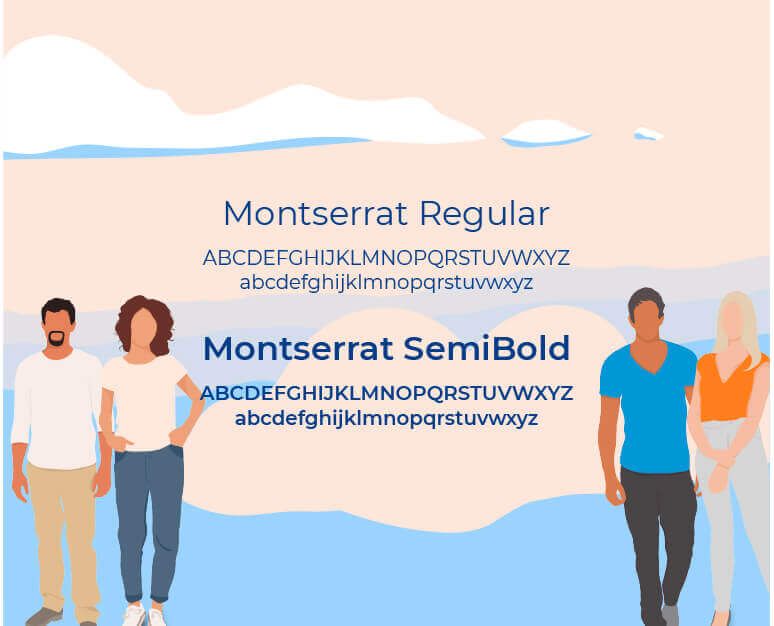
The team was keen to design illustrations to add to the branding. They illustrated each character to represent a different language the app offers, opting for a minimalist style with a touch of modernity. Throughout the process the team designed with inclusivity in mind, exemplified through the fact that the characters do not reveal any specific physical attributes or features. These newly illustrated characters have been used across the app, the Light Letter’s social channels and marketing mediums.
Animation
ONQOR Media worked on the design and animation to help advertise the Light Letters Languages app. As the app centres around communication, we wanted to create a video that didn’t use language at all, be it verbal or written. We decided that animation was the most innovative solution. Our animator created a brilliant animation that creatively showcases a doctor and patient using the app to understand each other.